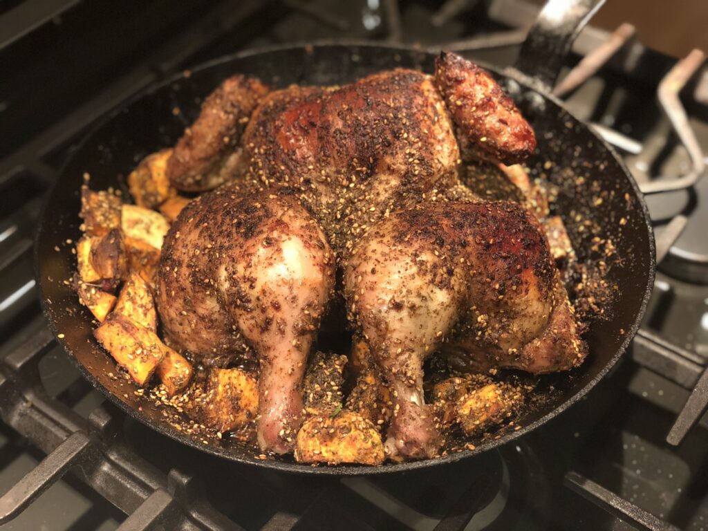
14 Aug 2010, 8:13am
Uncategorized
by Matt

leave a comment

iPad Love Montage

My iPad has slowly gained a share of my attention in ways I might have expected: I use it to read books, I use it to read the morning “paper”, I use it in lieu of maps or a GPS, and it now owns virtually all the daily “let me check the Web” moments that used to belong to my laptop. Occasionally, though, it surprises me, so I figure I’ll tell the story of a recent, unexpected eureka moment.

My wife is about to appear in her one-woman show, FEED THE MONSTER, at the New York International Fringe Festival, and during the production process I’ve done what I could to help with her Web site, mailings, and anything “technology”-related. One of these responsibilities is the construction of a slide show that we’re going to project behind her during the course of the show.

The Fringe Festival is an interesting beast, a two-week run of 200 shows performed practically end-to-end in just eighteen Manhattan venues (hats off to the Fringe organizers, who face an annual scheduling challenge on par with the NFL’s). As a result of this tight scheduling, productions get only one two-hour “tech” rehearsal in their actual performance spaces (most of the spaces are operating theaters with their own programming, so they can’t completely shut down to allow Fringe productions to spend a lot of time rehearsing) and in this two-hour block each production must practice setting up and breaking down, set up their lighting cues and other technical cues, and even adjust the show according to an individual space’s limitations or advantages.

Stephanie’s production staff includes a bunch of people who have plenty of experience with live musical gigs, live theater and Fringe Festival productions, so they take such pressure in stride. I don’t have any practical experience with live theater, so when I attended the tech rehearsal, with the primary responsibility of setting up the slide show, I really didn’t know what to expect. More importantly, I didn’t know I wasn’t going to know what to expect. Having worked on many a movie production, including that of a short film I directed, I am quite familiar with and comfortable with the seeming craziness of a movie set, and I figured that comfort would just translate to the backstage experience. Alas, while there are some qualitative similarities between a movie set and a theatrical tech rehearsal, the actual goals and tasks at hand are quite different.

All this is to say that my unfamiliarity with the environment, combined with the incredible excitement and pride and I felt for Stephanie and her accomplishment, had me a tad out of sorts. Luckily, my job was simple: work with another member of the crew to place a projector on an elevated shelf about halfway down the left side of the theater, run a 50-foot VGA cable from the projector into the lighting booth, and hook the cable up to my iPad via Apple’s adapter. I decided to run the slide show off Keynote on the iPad because I figured a laptop would just be too heavy and hard to tote around with all the other stuff we’d be carrying on show days. Good thing, too — the booth at La Mamma, Stephanie’s performance space, is pretty small, and the working area is completely filled by the light board, sound board, and cables. There was just enough space for the iPad between the light board and the sound board.

Alas, when we turned on the projector, which was 50 feet from the screen, we learned that the even the projector’s smallest screen size setting projected an image that was way too big for the screen. Only about 20% of the gorgeous images the show’s artists had created hit the screen, while the rest got sucked into the netherworld of the stage’s black fabric backdrop.  (Please don’t ask why we hadn’t anticipated this problem — I feel shame.)

As noted before, I was a little out of sorts and things were getting pretty intense, so this situation felt a lot like an emergency. After taking a quick dump in my pants, I figured I would try resizing the images on the iPad’s Keynote application, which I had never done before. While the lighting designer worked on her cues, I sat and resized the image on the show’s opening slide over and over again until it fit on the screen, and then took the next fifteen minutes or so to resize all the other images to the optimal 300X400 dimensions (there are 18 slides in total). It worked out nicely: the reduced images remained sharp even when projected at their smaller sizes, I backed up the presentation with an iWork upload, and I was able stop feeling like I was going to be responsible for the ruin of FEED THE MONSTER.

Okay, so it’s not the most dramatic story, but it was a happy little moment of iPad goodness (presumably one that could be repeated with another good tablet device, whenever someone releases one) that took me by surprise.

A few things I’d like to see on iPad’s Keynote app, though:

  • The lack of a true presentation mode is a real drawback, because you can’t see a preview of the next slide in the presentation. Even if it’s not as complex as the PC-based keynote application, something would be better than nothing.  In my case, where I was training someone else to run the presentation, this would be especially helpful.  As it is, I’m limited to identifying slides by number only.
  • Until you get the hang of it, the process of selecting and taking actions on objects in iPad Keynote can be tricky, and in fact I was never quite sure whether tapping, double-tapping, or holding on an object actually made it do what I needed. What I found myself wishing for was the ability to two-finger tap on an object and see a menu of available actions (delete, resize, copy, etc.) which is more along the lines of what I expect from my Mac’s trackpad.  I imagine that a lot of people might find themselves modifying presentations under pressure, so a simpler way to select objects and take action would be good.
  • A save as function, or at least some kind of history or undo functionality, is sorely missing.  If you make a mistake, delete something accidentally, or whatever, you’re screwed and need to rebuild from scratch.

Otherwise, smooth sailing.

P.S. – See FEED THE MONSTER, dammit.  It opens tonight and will have five performances over the next two week.  All the information is here.

6 Jul 2010, 5:00am
Uncategorized
by Matt

leave a comment

Listen to “Feed The Monster”, an original track from my wife’s upcoming show.

My lovely and talented wife, Stephanie Ehrlich, will be in this year’s New York International Fringe Festival with her one-woman musical show, “FEED THE MONSTER”.

The song below is the title track as sung by Stephanie in the guise of her character, Rita Emerson, a rocker whose career peaked in the late 60′s and has had a bit of trouble finding her life’s second act.  Stephanie wrote the lyrics and Jim Keyes (who also did the acoustic music for my short film “The Catskill Chainsaw Redemption“) wrote the music.

Give it a listen:

Audio MP3

The show times and venue for FEED THE MONSTER will be announced on July 10th.  You can sign up for Stephanie’s mailing list at her blog for updates.

Enhanced by Zemanta
17 Jun 2010, 8:30pm
Uncategorized
by Matt

1 comment

Dahon P8 First Impressions (Part II)

Well, for some strange reason WordPress published my earlier, incomplete post on the Dahon P8 without me knowing about it, so I’ll pick up where I left off:

Dahon P8

The Dahon P8 with a pack on the rack

Gearing and Power

I got the P8 because it’s among the faster bikes in Dahon’s lineup; during my test ride I never had trouble working up a head of steam.  I was able to pedal for speed on the steeper descents (the downslope on the Williamsburg Bridge and the hill that starts at about 88th St. in Central Park) though I had to spin pretty quickly — it’s definitely geared lower than the Jack.  It climbed the Brooklyn Bridge ascent quite comfortably in fifth gear (alas, it was unable to magically widen the bike lanes or prevent pedestrians from losing their minds and wandering around like zombies on the wooden boardwalk atop the bridge) though I don’t think it would have been a problem to keep it in eighth gear all the way up.

Shifting happens via a grip shift on the right handle, turning forward for lower gears and back for higher gears (a little weird since the Jack’s grip shift shifts in the opposite direction, but I’ll get used to it).  While not exactly on par with the Durace components on my Lightspeed, the P8′s components make for reliable, if not always quiet, shifting.

I did get worried when my chain started slipping and grinding in higher gears on my first day out — nothing makes it harder to trust a bike and enjoy a ride — but a quick adjustment at the bike shop straightened it out.  All in all, I’m happy with the gearing for urban riding.

Fit and Comfort

I think I’ll eventually find the right combination of seat height, handlebar height and seat position to make my P8 relatively comfortable, but if I’m ever really going to love it I’m going to have to stop wishing it would be more like a road bike.  The handlebar stem and seat posts are a lot closer together than on my full-sized bikes, and in order to feel like I’m not curling up like a boiled shrimp I need to raise the handlebars fairly high and sit up almost straight. (At least it feels like I’m sitting up straight compared to the way I’m used to riding; I’m sure an observer would just think I look like most people do on a bike.)  I think smaller riders (I’m just a shade under six feet tall) might feel the difference a little less, but I doubt the P8 would be appropriate for anyone much taller than I am.

In order to fold the bike, you need to raise the handlebars and drop the seat all the way into the frame.  This means you’ve got to return them to their riding positions when you unfold the bike.  Oddly, while the seat post has a numbered rule along the front to make it easier to remember the proper height, the handlebar stem has no such markings.  A weird oversight on Dahon’s part, though perhaps it’s a deliberate choice to keep costs down.

Dahon P8 Seat Post

The Dahon P8 seat post markings

The pedals and handlebars are a bit narrower than my Jack’s, an advantage in the city since I often find myself squeezing between pedestrians and cars, passing slower riders in narrow bike lanes, or otherwise snaking through small spaces.  The thoughtfully-designed, wing-shaped handles are really comfortable to grip and lean on, though they have a cheap, plasticky quality and emit troubling creaking noises on occasion.  I get the feeling mine are a little loose and in need of adjustment; stay tuned for updates.

Dahon P8 Handle

The strangely creaky P8 handle

All in all, the fit is acceptable, if strange.  I’m curious to see if my weekend bike starts feeling weird to me once I start using the P8 every day.  I’ll be sure to let you, my legions of readers, know how it works out.

Accessories

I bike commute year-round and in any weather (except accumulated snow) so I added front and rear mud guards and a rear rack when I bought the bike.  I became immediately distressed because I thought the rack was preventing the bike from folding all the way, but this was just user error, as my friendly bike shop proprietor patiently pointed out: I was lowering the handlebars instead of raising them when I folded the bike. That said, both the front and rear mud guards had genuine problems: the front guard slipped a bit in the course of my first ride and started scraping against my wheel; a little later, a screw holding the rear guard in place popped out, causing the guard to dig into the wheel and prevent it from spinning.  I was able to fix the front guard myself, but I needed to return to the shop for a new screw.  Not a big deal, but a little annoying.

Dahon P8 Front Wheel

The P8 front wheel with mud guard

Handling and Maneuverability

This is where the P8 really has an advantage over the Jack for city riding. The smaller wheels give it a really tight turn ratio and make it handle almost like a scooter.  This was most obvious during my test ride on the Williamsburg Bridge’s switchback entrance ramps, though almost as notable was the better balance at lower speeds (that said, I almost tipped over when I tried to stand up on the pedals to climb a hill, so I’ll have to practice that a bit).  Overall, the city-appropriate maneuverability is what has me most excited to keep getting back on the P8.

Other Observations

I noticed a bunch of quirky little things about the bike throughout my first day with it: its handlebar stem is straight up and down, not bent forward, so you can’t grab it like a handle when you walk the bike; locking it up is a bit different because the frame is so compact (I use a chain for the back wheel and frame, a long cable for the front wheel, and secure them both with a single Kryptonite lock); and though folding bikes are fairly common, it still seems to prompt more than its share of extra glances and questions from my neighbors (the most common of which is “is that a folding bike?”).  My colleague who has a similar bike says it makes him feel like a circus bear, but I’ve convinced myself that it’s a bad-ass ride in its own special way, so please don’t disabuse me of that notion if you should see me peddling by.  I think I’m going to stick with the P8 for a while.

16 Jun 2010, 5:10am
Uncategorized
by Matt

1 comment

Dahon Speed P8 First Impressions

I’ve been riding my new Dahon Speed P8 (that’s an 8-speed folding bike with 20″ wheels from Dahon’s “urban performance” line) for the past couple of days in anticipation of making a permanent switch from my current bike, a Dahon Jack (a 7-speed, full-sized folding bike with 26″ wheels) so I figure my impressions might be useful to anyone thinking of making a similar move. The quick verdict:  I like it a lot and am looking forward to making it my primary city bike, but there are a few things worth discussing.

First, some quick background:

I’ve been bike commuting in Manhattan for about six years.  I rode a fixed-gear bike for a while, but a couple of years ago I decided to switch to gears for a few reasons:

  • My commute includes the entirety of the Central Park traffic loop, and my gearing wasn’t high enough to let me pedal downhill for speed. I lost precious seconds every day while coasting.
  • I find myself needing to throw my bike into a car more than most people, and that’s a pain with a non-folding bike.
  • Similarly, I wanted something I could put in a cab if, say, I ate too much duck blood stew after work at Sichuan Gourmet and couldn’t ride home.
  • I don’t live in Brooklyn and am over 40, so I’m in no danger of losing fashion cred if I don’t ride a fixie

That initially brought me to the Dahon Jack, which, unlike most folding bikes (and as noted above) is full-sized and rides a lot like a midrange mountain bike.  I like it a lot.  It’s built like a tank, has plenty of useful gearing, and folds in half for elevator rides.

Alas, as much as I like it, I’ve found it wanting for a few reasons:

  • I carry my bike down a narrow flight of stairs in the morning, and it’s a tad unweildy
  • It requires a hex wrench to fold its handlebars, so it doesn’t quickly collapse into a neat package like most smaller folding bikes. This is a huge drawback.
  • As it turns out, it’s too big to toss into the back of a car or the trunk of a cab, even when folded.

I flirted briefly with the idea of splurging on a higher-end folding bike from Brompton or Bike Friday, but I didn’t want to subject a $1500 (or way more expensive) bike to the gritty, sandy, salty trials of year-round New York commuting. I test rode a bunch of less expensive bikes and eventually settled on the P8 because it rides smoothly, has a fun fire-engine red finish, and lists at a relatively reasonable $650.

I’m still riding my old Jack because my office is under construction and I can’t bring the P8 inside yet, so I didn’t get to spend any quality time on the P8 until I took it to Brooklyn and back last weekend (and followed up with a ride around Central Park the other night). Here’s what I think so far:

Overall Impression

Some reviews of the P8 say it rides just like a regular bike, but I don’t think it’s any more a substitute for a full-sized bike than tofu is a substitute for meat.  It’s just a different thing with its own properties and flavor.  It has an undeniably toylike feel due to its smaller wheels and lower center of gravity, though this isn’t a complaint — I think it’s actually an advantage in some ways (I’ll discuss this more in a bit).  The entire rig sits a lot lower than a full-sized bike, so I rarely catch a glimpse of the front wheel or much of the bike frame at all. In fact, when I’m on the bike it feels like the seat and handlebars, the only parts of the bike I’m aware of, are sort of disembodied.  It takes some getting used to, but it’s fine after a while.

Gearing and Power

I got the P8 because it’s among the faster bikes in Dahon’s lineup, and I never had trouble working up a head of steam.  I was able to pedal for speed on the steeper descents (the downslope on the Williamsburg Bridge and the hill that starts at about 88th St. in Central Park) though I had to spin pretty quickly — it’s definitely geared lower than the Jack.

Shifting happens via a grip shift on the right handle, turning forward for lower gears and back for higher gears (a little weird since the Jack grip shift shifts in the opposite direction, but I’ll get used to it).

(Sorry folks, this post seems to have published by itself before I was finished.  I’ll continue in a follow-up post.)

12 Jun 2010, 11:07am
Uncategorized
by Matt

leave a comment

Why a Web redesign announcement irked me

I’m not a noted internet thinker or influential VC or visionary entrepreneur, just a workaday product manager who has been building Web sites for a long time and has a well-formed set of beliefs, opinions and peeves.  One Web company habit that particularly annoys me, as I Tweeted about yesterday, is the compulsion to announce site or branding redesigns in advance of their launches.

These sorts of e-mails bother me for a few reasons:

  • They mean more to the people sending them than the people receiving them
  • If you’re planning to change your site and product, and you want me to be a customer, at least spend a few pennies before your big redesign to do a survey and ask my opinion of what I like and don’t like about your current product.  Don’t just send me an e-mail telling me things are going to change.
  • An upcoming change to a Web site is just that: an upcoming change. It’s not there right now.  I can’t imagine what it is or why I should care about it.  The great think about the Web is that you can use things and click on things and try things to understand what they are. You want to get me interested, launch a site and e-mail me a link to it.  Better yet, as I mentioned above, do it well in advance of your redesign and see if I really do like it.  If not, you have time to change it into something meaningful.

A case in point is the Compete.com e-mail I received yesterday with the subject line “Compete is Getting a Face Lift!”

Now, I have absolutely nothing against Compete.com.  A service dedicated to helping Web marketers understand competitors’ metrics can be useful, especially if you trust the methods used to gather the metrics.  But their rebranding announcement struck me as a wasteful misfire, and since it’s raining and I can’t get on my bike, I might as well take a minute to explain why.

First off, the subject line: “Compete is Getting a Face Lift!”  This breathless exclamation tells me far more about the echo chamber in which your brand and marketing managers have been living for the past six months than about anything of significance to me.  I’m sure the process of selecting an agency to retool your color palette felt urgent, the long meetings spent debating the look and feel over take-out food were exhausting and touchy, the path to a final decision was full of obstacles and frustrations. Perhaps someone on your board asked you to let their friend’s son, who wants to get into internet design, weigh in on the colors. Maybe your internal design staff resented the decision to use a brand consultant to help with the process.  Maybe you went through months of iteration only to come full circle.

I have no idea what happened, but I’m pretty sure I’ve seen it happen before.  And congratulations: look and feel and branding are incredibly important. You deserve your salary and a redesign launch party.  You deserve to be excited to finish the “face lift” process at last, and you’re perfectly welcome to write about it with exclamation points.  Still, is your relief worthy of an e-mail subject line?  Is it really interesting to someone else?  The only reason I opened the e-mail is because I’m perversely fascinated and annoyed by “we’re going to change our Web site” announcement genre.

This e-mail’s prioritization of Compete.com’s internal concerns over their users’ concerns continues in the first paragraph:

Compete User,
Next week, we will proudly debut our new brand alongside a major update of our Referral Analytics product! See a sneak peek of the newly designed logo up above.

Again: If you’re planning to release a visual change next week, tell me about it then.  Showing me a “sneak peek” of the new logo (by the way, it’s not a sneak peek of the logo — it’s the logo in its entirety, and there’s nothing sneaky about it since you’ve actively pushed it to me) is not the same as showing me a site.  I might be interested in the update of your Referral Analytics product, but apparently you assume that your product — that’s the thing that actually will make me decide whether to be your customer or not — is less important than your logo and the new brand.  (You also forgot that many e-mail clients block images by default, so your invitation to look at the logo “up above” didn’t make much sense since I didn’t see anything up above.  Perhaps you’re trying to drive me insane by telling me something is there that isn’t.  Well, get in line — the invisible talking guinea pig in my printer hasn’t made me crack yet, and neither will you.)

More importantly, though, you shouldn’t address me as a Compete user if I’m not a compete user.  You have my e-mail address, so I figure you must have some registration and usage data on me, and if you bothered to look you’d know that I haven’t logged in to your site in years.  In this day and age, it’s mighty easy to take an extra few minutes to segment your users.  Address me according to your real relationship with me, and don’t hit me with impersonal spam.  If you were really interested in my business, you’d have known I wasn’t a big user of your site and you would have created a message much more appropriate to someone who hasn’t been using your services but might benefit from your new offering.  So when you start the next paragraph with:

Compete is inspired by people like you.

I can only think “and by ‘people like me’ you mean people who you know nothing about and have no relationship with”?  I wish I could come by inspiration so easily.  It continues:
And, just like you have surely changed over the past couple of years, Compete has changed as well.
I have changed a lot over the past couple of years.  For one thing, three years ago I changed my Web career focus from high-volume publishing sites to B2B productivity and consulting tools, and I haven’t been to your site since then.  How might Compete’s changes apply to me now?  (In fact, I am working a personal project right now that’s related to the genealogy world, and I might really want to use your product to understand where I fit in.)  Oh, wait, you’re not thinking about that.
Quite honestly, the people were very web 2.0.
Thanks for being honest about what you thought of “the people”.  One question: Who the f are “the people”?
Compete delivers digital insights through industry leading products and
services to our clients every day and we wanted the logo to reflect that.
Well, mazel tov!  I’m glad your clients like you.  As noted earlier, I’m not one of them.  Do you want me to be one?  If so, please tell me how your product might apply to me, and don’t tell me about your other clients.  Meanwhile, stop thinking so little of your clients that you assume they’ll shell out for more “industry leading products and services” if you change your logo. I won’t mention that now would be a good time to tell me what some of those products and services are, because you have more important things on your mind:
After months of long meetings and heated debates we’ve decided it’s time to bid farewell to “the people.” They’ve been very good to us and will forever be part of who we are.
Oh, I’m starting to get it.  You’re logo incorporated images of people, and you expect that I visit your site so often, and think about your brand so much, that I give a tinker’s patoot about your decision to remove “the people” from your logo because it was too “Web 2.0”.  Seriously, those heated debates and long meetings might have made your decision to kill “the people” seem important, but maybe you should have spent a little more time debating your product and how it might matter to “the people” you’re e-mailing.
Take the weekend to remember the great times you’ve shared with our three orange friends and get ready for some big changes next week!
Okay, now you’ve really gone over the edge.  I do not know the people.  I do not know they were orange.  I do not consider them friends and I have not been to your site in years.  You are deluded and weirdly intense and maybe you’re even drunk.  We never shared anything.  Don’t stand so close to me.  I can smell the dry-cleaning chemicals on your shirt.  And if you think I’m going to spend any time this weekend thinking about your brand, or doing something like writing a missive about your e-mail on a Saturday morning, you’re wrong.  It’s never going to happen.
5 Jun 2010, 5:02am
Uncategorized
by Matt

1 comment

Will My Pig-Roasting Assignment Yield a Good iPad Use Case?

Today I have the honor of roasting a pig at my friend’s wedding at a farm in Dutchess County, NY. This means I’ve got to find my way there and spend about six hours tending the pig by myself before the guests arrive. I think my iPad is going to be a good companion, what with its maps app and a couple of nice books and movies betwixt its [whatever things are betwixt in an iPad]. Let’s just hope no actual people try to talk to me because I’m not sure how the iPad will help me there.

15 Feb 2010, 10:22am
Uncategorized
by Matt

1 comment

The Ministry of Ill-Advised Ideas Presents: Panko-Crusted Head Cheese on Pretzel bread.

I unexpectedly found myself in possession of a large hunk of head cheese last night, so at the suggestion of the amiable lunatic who bestowed it on me, I breaded a slice in panko bread crumbs and fried it.  I then set it atop some pretzel bread I’d made earlier in the weekend and garnished with mustard and pickle slices. It  made a fine slider.

Here’s the frying.

Here’s another shot of the final product.

30 Dec 2009, 8:38pm
Uncategorized
by Matt

1 comment

Chinese Leftover-based “Spaghetti and Meatballs”

Meatballs made of leftover dumpling filling, rice noodles, chicken broth, and leftover long beans.

4 Oct 2009, 3:28pm
Uncategorized
by Matt

leave a comment

Roast Pig

IMG_0021

103 pounds uncooked.  With side dishes, it served 70 adults and 20 kids at the Second Annual Driveway Pig Roast.

1 Oct 2009, 5:08am
Uncategorized
by Matt

leave a comment